
UI Components
For now, you are expected to have Tailwind Preflight installed, this won't be necessary in future.
It must be imported before@membranehq/react/styles.css.
Each component and its parts can be addressed by their unique class name. You can use them to style your components and interact with them.
You can find a full list of parts and class names of a given component on its respective documentation page.
Default Styles
To apply default styles to components, simply import styles.css:
import '@membranehq/react/styles.css'Custom Styles
All style layers exported by styles.css are prefixed with iap- value to prevent layers collision.
@layer iap_reset, iap_base, iap_tokens, iap_recipes, iap_utilities;Let's looks at the imaginary button component example:
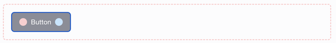
Styling with CSS
When using plain CSS it is enough to just use className of a part.
Let's change button background color to red and both icons to black:
/* styles.css */
@layer iap_reset, iap_base, iap_tokens, iap_recipes, iap_utilities;

@layer iap_reset {
  @tailwind base;
}

.button__container {
  background: #e54d2e;
}

.button__container:hover {
  background: #dd4425;
}

.button__icon-left,
.button__icon-right {
  background: #000;
}import { ExampleButton } from '@membranehq/react';
import './styles.css'
import '@membranehq//react/styles.css'
const App = () => {
return (<ExampleButton />)
}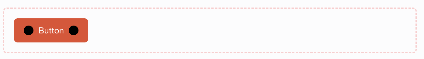
Example
Styling with Tailwind
For projects that use Tailwind an extra step is required.
To avoid layers order collision you need to define layers in your main css file.
You can target part className by using @apply directive.
In this example let's make button sharp and blue, then change the title text style to bold:
/* styles.css */
@layer iap_reset, iap_base, iap_tokens, iap_recipes, iap_utilities;

@layer iap_reset {
  @tailwind base;
}

@tailwind components;
@tailwind utilities;

.button__container {
  @apply rounded-none;
}

.button__title {
  @apply font-bold bg-blue-700;
}import { ExampleButton } from '@membranehq/react';
import './styles.css'
import '@membranehq//react/styles.css'
const App = () => {
return (<ExampleButton />)
}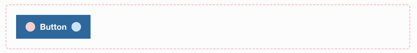
Example
Updated 11 days ago